ShopDreamUp AI ArtDreamUp

Tip Jar
Support my work by contributing to my tip jar. This tier won't include any specific perks, but you will receive my appreciation.
$1/month
How to fix DA's horrible image compression
Yes, image compression is still a thing
As you might recall, i wrote about this issue some time ago. Yep, it’s been over a year. What has happened since? Not too much, i’m afraid. Things were being discussed for a while, until back in March of this year when we got one final official update (that i know of). Has the issue been fixed since? Nope, it certainly has not.
Now here’s the kicker: I did some digging and found a shockingly easy fix.
Let’s take this image by the talented JenZee (https://www.deviantart.com/jenzee):
Note: Jen Zee isn’t just anyone. She’s the Art Director of Supergiant Games, responsible for the amazing games Bas
Eclipse, pt. II
I was thinking for a while now about giving Eclipse another chance and write a followup to my last journal. It's been 4 months, after all, and a few things have changed. (I would like to link you my old journal decently for comparison, but the new journal editor won't let me add a simple text link, and i don't want a giant thumbnail breaking the flow of this.) So, in order to get me in the proper mindset, it would make sense to try Eclipse for a while, and even use the Eclipse tools to write this journal. (Spoiler alert: it ruined my day.) The first hurdle in writing this was finding the textarea – you know, the input field where you write your actual journal in. This should be a no-brainer, but believe it or not, i could not find it at first. On the top of the page it says "Add your title here", so that's pretty straightfoward at least. But where's the main textarea? There's only a Plus icon with a greyed out "Share what's on your mind". When i click the Plus, i get a popup that lets
re: Eclipse
Note: This journal is now many months old, and a lot of things i talk about here have since been fixed, or at least addressed. Not all of them, mind you; and the gist remains: Eclipse is vastly different from the current “Green Site” and introduces many changes, and not all of them for the better (in my opinion). Feel free to continue to share/mention this journal (you have my thanks!), or read Part II of my analysis.
Alright, where do i begin? After having used the Eclipse Beta for a while, i have collected a bunch of thoughts – and i have also submitted lots of them as feedback via the appropriate channels. Regardless, i
dA, stop ruining our images!
Update
Good news everyone! I just got confirmation that it’s a bug and being worked on. Thanks, spyed (https://www.deviantart.com/spyed)!
Original journal
The eagle-eyes among you might have noticed that something is going on with our deviations: They look somewhat worse than before. Why? DeviantArt is now compressing the full-view – and rather aggressively so! Previously, the full-view was exactly what you were uploading (unless you specifically told the upload process to scale it down). But now, the full-view gets re-saved as well. Worse, they're in the process of re-saving all (most? some?) of existing deviations across the site. (It seems, only JPEGs ar
Comments43
Join the community to add your comment. Already a deviant? Log In
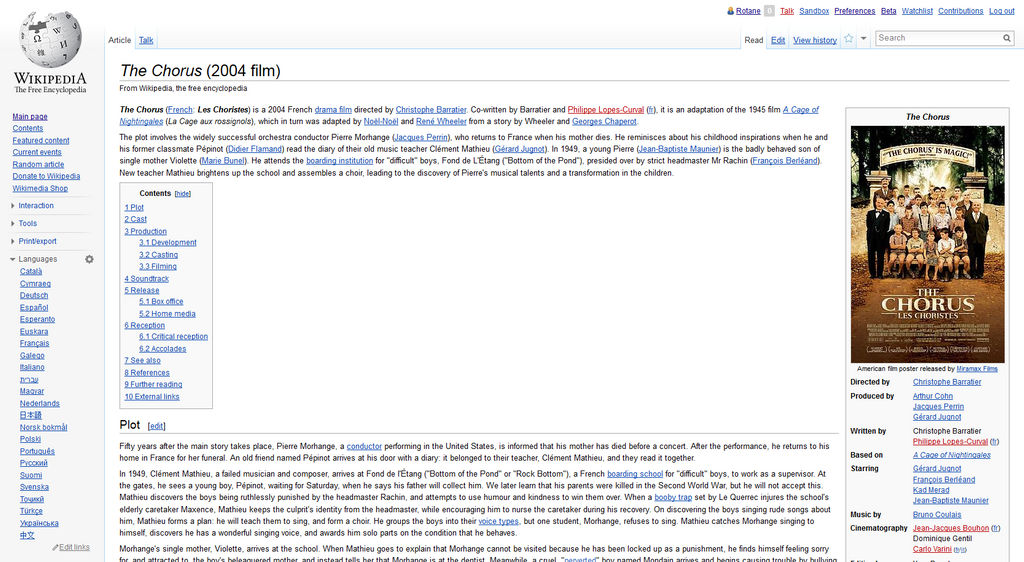
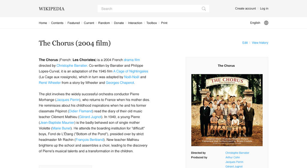
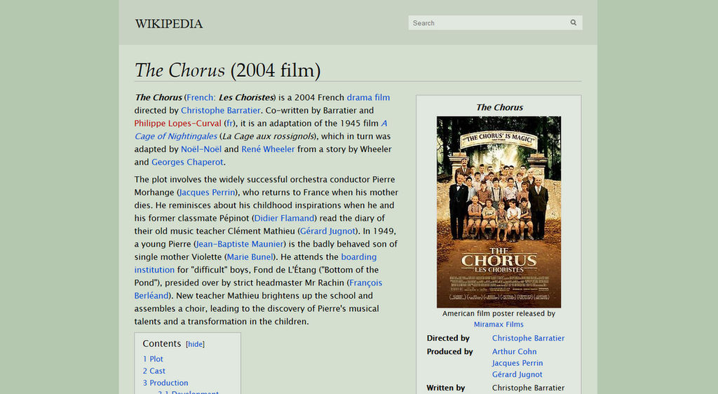
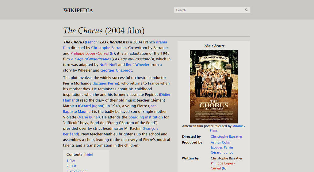
It looks that this awesome CSS is a little buggy on the French version of WikiPedia. I hope it will be fixed on the next release. Thanks
https://fr.wikipedia.org/wiki/Houmous


